
What’s in a font? 💭
When you’re busy creating social media graphics for or designing branding for a client, the font or fonts you choose may come as a bit of an afterthought.
However, it’s important not to take this decision lightly, as your choice of font can make or break your intended messaging.
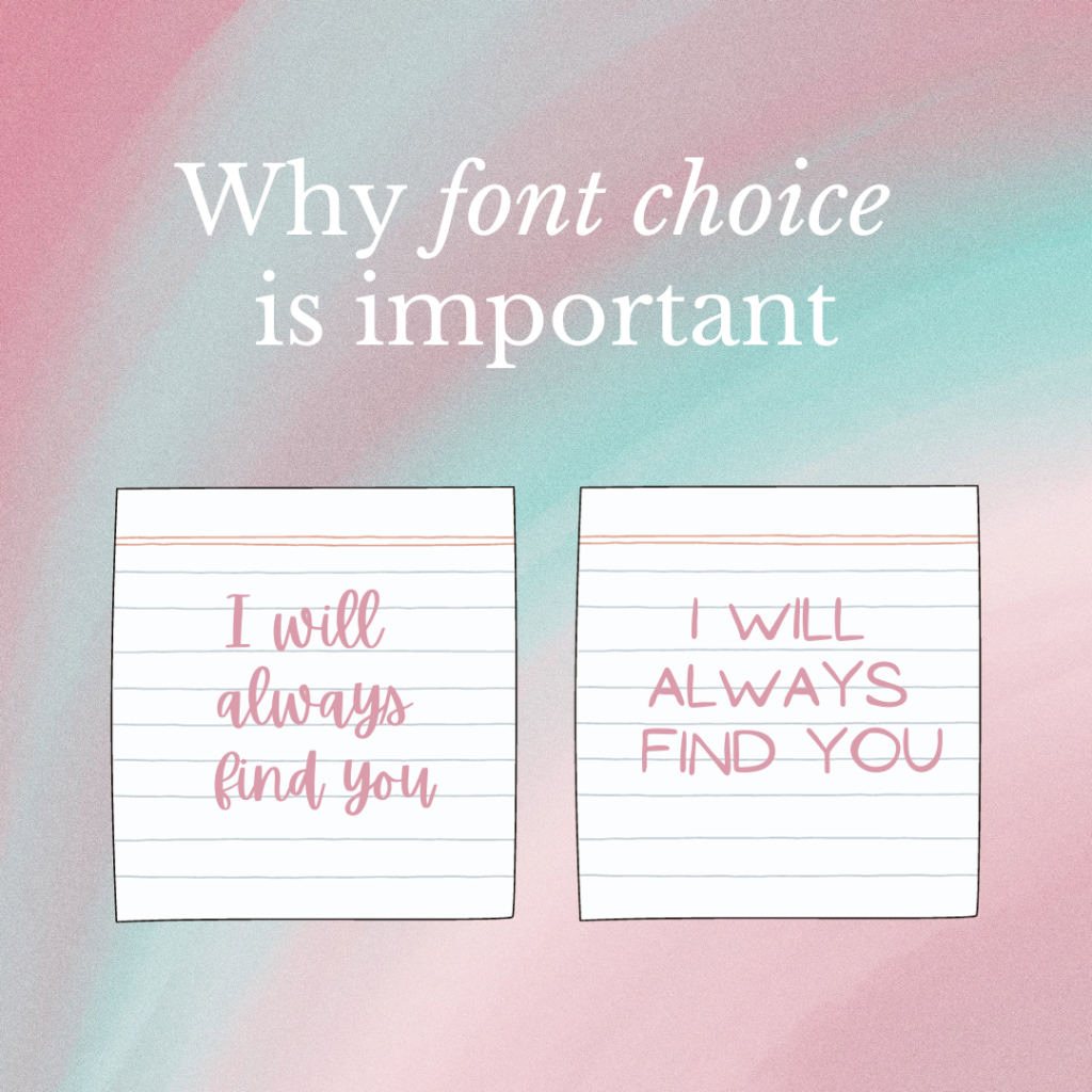
Take our graphic, for example. In a soft-edged font, the text is reassuring, loving. In a harsh font, it comes across as vaguely…threatening. 👀
So, how do you choose the right font?
✨ Branding. Pick a font which reflects your brand. If your brand is fun-loving and colourful, a plain, serious font isn’t the best choice to communicate this to your audience.
✨ Legibility. Make sure you choose a font that’s easy to read. While you may be tempted to use swirliest of fonts for body test, your audience might find it challenging to read – and may just ignore it. More ornate fonts work better for shorter pieces of text, such as titles.
✨ Don’t use too many. It’s recommended to use 2-3 different fonts for each design, as any more than that can begin to look cluttered.
✨ Avoid using fonts that look too similar. The fonts you choose should be distinct and complement each other for your design to be its most eye-catching.
What are your favourite font combinations? Let us know in the comments! ⬇️